Fiona Sheng

Artist | Creator | Educator

About “autumn”

In the Northern hemisphere we are embracing the autumn already. Autumn is such a pretty season, it is full of colours and is inspiring for people who love painting or photography. I certainly enjoy this period of time a lot, and I secretly love the European autumn more, because it lasts so much longer than in my hometown! In the Chinese language, the character for autumn has some interesting stories to tell, would you like to find out about its origin?

The character of autumn is “秋”, which is a character that has the “crop” on the left side and “fire” on the right. But this is only how we see it today, in the long historical evolution this character has actually changed a whole lot!
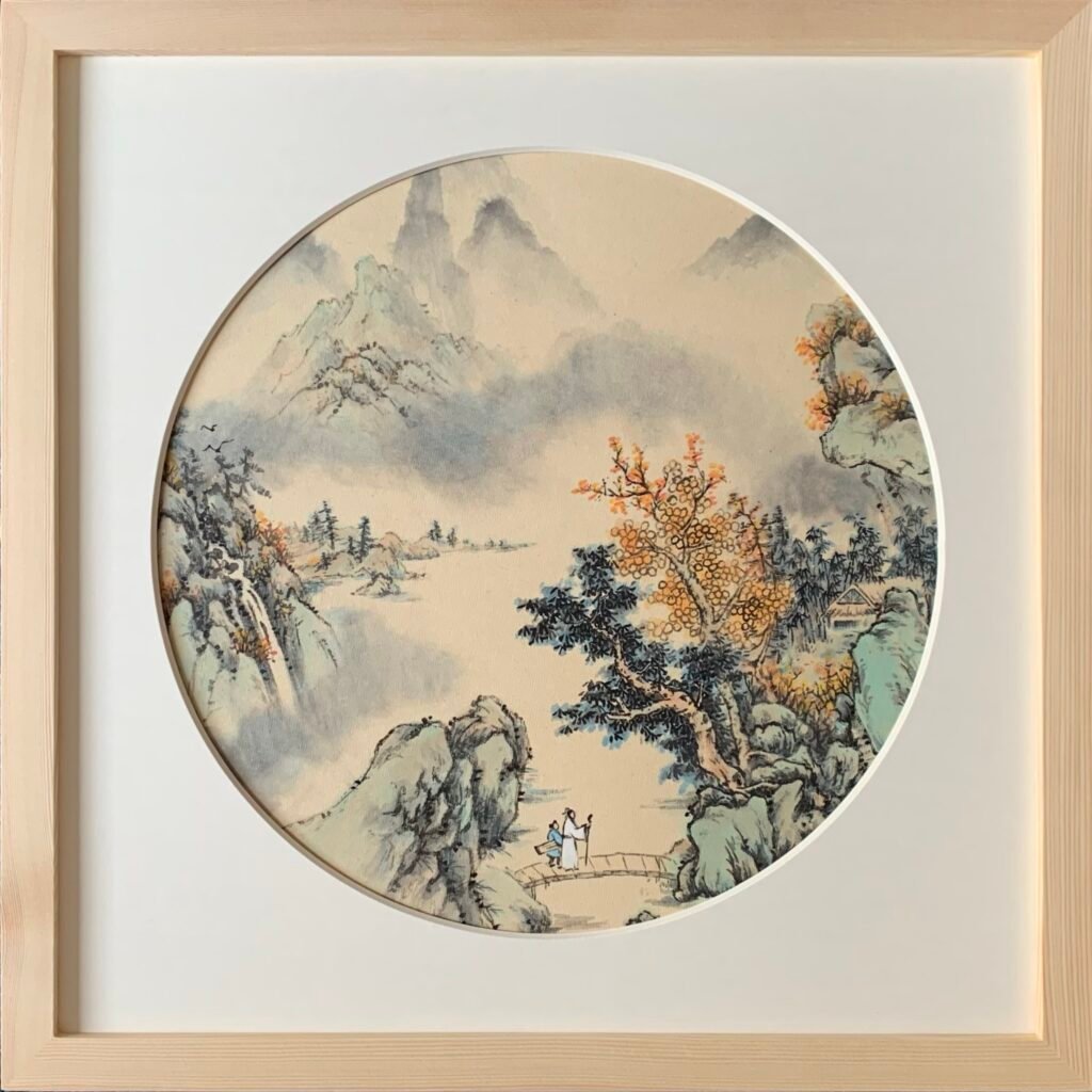
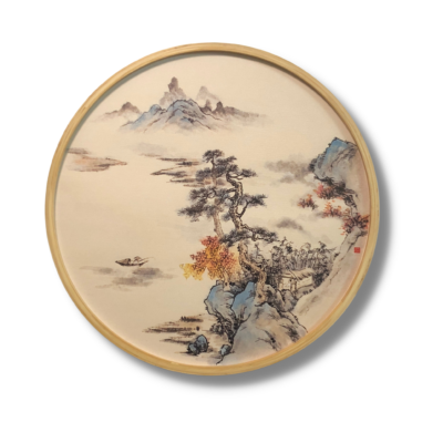
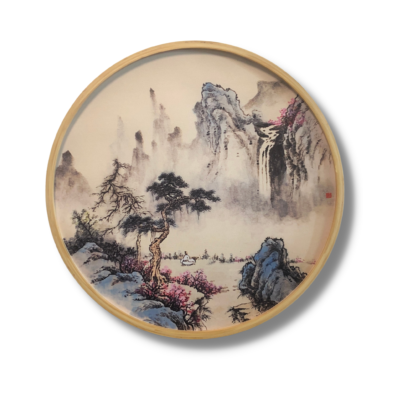
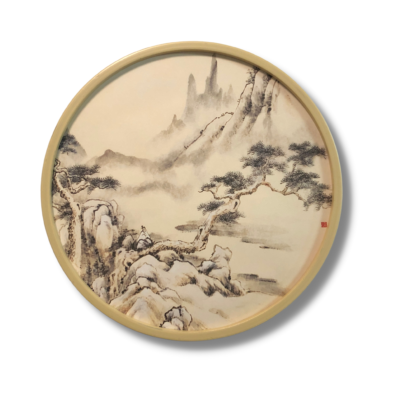
Autumn landscape, Fiona Sheng

In the beginning, autumn had to do with crickets or grasshoppers (the first two examples on the left side). We can clearly see how this character used to look like in the oracle bone script below. Obviously there were various ways of writing this character in this script, but they all resemble this general shape of a bug, with the tentacles on the head and some legs on the left. Also the field in the ancient time needed rest before the next planting session, which requires burning, and “fire” became a necessary component in this character, but the bug side slowly evolved and disappeared. Some theories say that the fire was also used to kill the grasshoppers that eat crops, but either way, a new component meaning “crop” started to appear in this character.

In the Spring and Autumn period this character started to take on a “turtle” side (see the example below on the far right side), rendering it too complicated to write. The various components of this character change location occasionally, but the character does not change in the meaning.
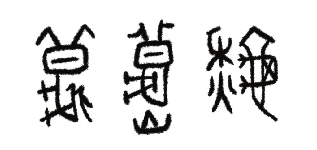
Since the union of Chinese calligraphy in the Qin Dynasty, the character of autumn started to be regulated to having two components only, the “crop” and the “fire” (see the example below on the left side). Although these two components also switch location from time to time for a long duration since then. The other two examples below shows some other variation of the Jinwen, another ancient style of script before the Qin Dynasty.

Now this character of autumn has been clearly determined to be written this exact way “秋”, however in Chinese calligraphy the two sides may still switch, for artistic purposes mostly. How do you like the final version of the character of autumn? Would you miss the bugs inside?

Enjoy such cultural discussions? Have comments? I look forward to hearing from you!


Our Online Courses


Buy Artworks | Learn Brush Painting | Learn Chinese Calligraphy

About “autumn” Read More »

The circular culture

Tomorrow will be the Mid-Autumn Day, also known as the Mooncake Festival, so happy Mooncake Festival everybody! This is the time of family union, and in this post let us follow the tradition and gather around to admire the moon above us, have a cup of tea while eating some nice food as we talk, shall we?

A long long time ago in the East far far away, there were a group of people who loved round things. The ancient oriental belief systems held a deeply-rooted belief that stated “the sky is dome and the earth is square”. As the very first root of a giant cultural tree, this belief has its extensions and applications consciously or subconsciously in almost every single branch that developed from this tree. So the notion of “round” equals “fulfilment” and “complete” took root in all the children and children’s children’s hearts of this cultural sphere until this very day.

Weekend Sale

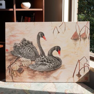
This weekend as a celebration, our Bunny in the red leaves Round Wall Art (canvas print) will be on sale, you will receive 10% off over ONLY this weekend, and there are ONLY 3 prints available. Come quick!

Remember the bunnies and the moon? If not, come to our live streams to find out!

The circle not only represents the heavens, it also since the start of the oriental culture represented change and reincarnation. Just like in the theory of Yin Yang, where the world moves following certain regulations, and the wax and wane of all matters are normal. Events also evolve in a similar manner, where history eventually repeats itself, starting from the beginning. Perhaps gazing up into the night sky at the moon inspired a few great minds? We can only guess, but the oriental wisdom has a way to regulate the extremes and normalise our lives for us.

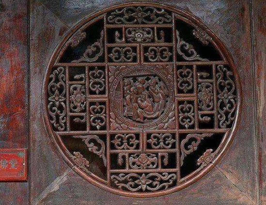
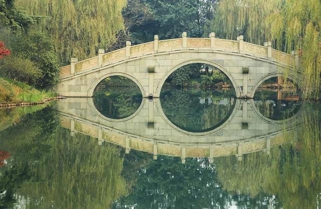
The application of round and circular shape is definitely seen everywhere, starting from architecture. You must have seen at least some images of the round shapes used in the traditional architecture, such as windows, doors, bridges, and sometimes even entire buildings. The shape feel safe, harmonious, comforting and pleasing, our sentiments towards it may have been carried in our genes.

Round window, photo from the internet
Round door, photo from the internet
Bridge, photo from the internet
Round building 土楼, photo from the internet

In the smaller cultural aspects of our lives there are ubiquitous round shapes too. The Chinese chess, ancient and modern coins, traditional plates, bowls, and jewelries, in all these objects the most common shape is round. In the oriental art, the best lines are never either round or sharp, we say there has to be edges in the roundness and in the roundness there has to be holding structures. Below is a fragment of a calligraphy piece written by one of the most important artists of the Cursive Script, where such lines are clearly visible. Even though you do not understand what has been written, nor do many Chinese people who has not been trained in such arts, you must be able to appreciate the flow, the harmony, and the emotion – we see round shapes everywhere yet nowhere, a true masterpiece.

Cursive Script, Zhang Xu, Tang Dynasty

Finally I would like to introduce you a rather important round object, the mooncake. We started the discussion from the Mid-Autumn Day, and on this day if you can find a Chinese store normally you can get a piece of mooncake. They are round and golden, just like the full moon on this very night. They are rather tasty, but do not have too much of it in one go, they contain quite a lot of sugar and oil. Although there are many healthier versions, and you can find many types of stuffings, some sweet, some savoury. Enjoy!

Egg Mooncake, photo from the internet

Enjoy such cultural discussions? Have comments? I look forward to hearing from you!


Our Wall Art Collection


Buy Artworks | Learn Brush Painting | Learn Chinese Calligraphy

The circular culture Read More »

Signature in an artwork

We know that the oriental artworks are often a combination of the painting, calligraphy, poetry and seals. When looking at a piece of painting, it will be clear that the main part of the painting is the images, but it will not be so clear when looking at the calligraphy on the artworks – we cannot identify the function of these characters directly without certain background knowledge, because some many be the title, some may be a poem, and others may be the signature. Let us focus on the signature today, and after this post you will know more about signing your own works!

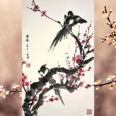
Flower Bird Painting, Fiona Sheng

Above is an artwork I recently created, and on the top left side there is a line of writing that consists of the title and the signature. The simple way to tell the title and the signature apart would be by the size of them. The larger characters are usually the title, which is followed by the signature. Sometimes the title and signature section go horizontally, and in which case it is important to know how to read (assuming you can read Chinese characters) them.

Traditionally the writings follow the direction of Top-Bottom, Right-Left. So when reading the writings on a piece of oriental artwork, ancient and modern, the correct starting point would be the most top right side. In the past book pages also follow this order, which is still the case nowadays in Japanese manga! Even though in the modern Chinese texts the writing direction has switched to the same as in English, the traditional art still follow the traditional ways, so the characters are written in the old direction and in traditional Chinese characters, not the simplified ones.

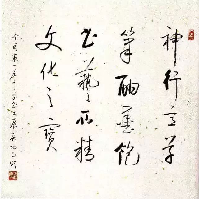
Calligraphy, Qi Gong, Photo from the internet

Focusing on the signature alone, it is normal to only have the name written down, which can often be 1-4 characters long, and sometimes we add a character “書” behind it, meaning “xxx wrote”, but this character alone means both to write and the word for book. Other than signing short names, it is also very common to sign the purpose of the artwork or the year before the name. In the first painting in this post, you can see the title-year-name style, and in the photo above it states the purpose and then the name. This way the length and meaning of the signature is adjustable, fitting to the artwork.

When signing with the year, which is the most common signature style, the year should be signed in the traditional way, which means instead of writing “2022”, we write “壬寅年” instead, the way it was supposed to be in the Stem-Branches or Ganzhi system, also known as the sexagenary cycle. This is an ancient and long-surviving recording system that was common in the Eastern Asia, but its application can barely be seen other than in artworks anymore. As stated in the name of this system, it repeats every 60 years, and that means the same name of the year comes back once every 60 years.

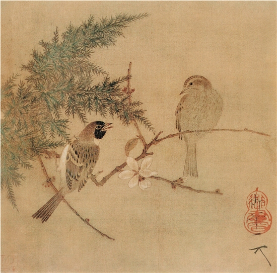
Flower Bird Painting, Song Hui Zong, (example of a very short signature)

So how do we get the 60 year cycle? We have 10 stems and 12 branches, and we match them according to certain orders. These heavenly stems, written as 甲乙丙丁戊己庚辛壬癸, their functions are just like numbers 1-10, indicating an order; the earthly branches are animals, the same animals for the zodiacs, and they are 子丑寅卯辰巳午未申酉戌亥, each referring to an animal. It is worth noting that these character cannot be used to refer to the animal directly, they are associated to the animals only. Every other character from the top line matches with every other character from the bottom line, and then we have the complete chart of exactly 60 matchings:

甲子乙丑丙寅丁卯戊辰己巳庚午辛未壬申癸酉
甲戌乙亥丙子丁丑戊寅己卯庚辰辛巳壬午癸未
甲申乙酉丙戌丁亥戊子己丑庚寅辛卯壬辰癸巳
甲午乙未丙申丁酉戊戌己亥庚子辛丑壬寅癸卯
甲辰乙巳丙午丁未戊申己酉庚戌辛亥壬子癸丑
甲寅乙卯丙辰丁巳戊午己未庚申辛酉壬戌癸亥

One day I will show you have to write them in correct calligraphy, but for now if you need to sign your work, you have some notes to help!

Enjoy such cultural discussions? Have comments? I look forward to hearing from you!


Our Courses


Buy Artworks | Learn Brush Painting | Learn Chinese Calligraphy
Signature in an artwork Read More »

Oriental landscape painting development

In the previous post we discussed the key concepts of the oriental landscape arts, how it is very much linked to our perception of the world around us; how it is a reflection of the relationship between us and nature. In this post let us dive a bit into history and briefly talk about its origin and development.

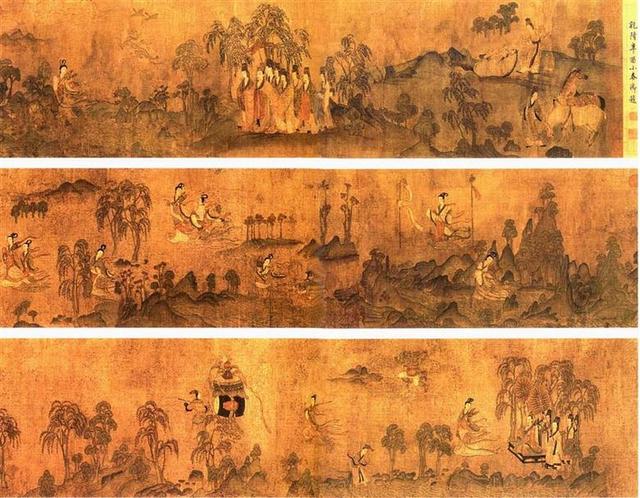
Rhapsody on Goddess of Luo, Eastern Jin Dynasty, Gu Kai Zhi

The landscape painting in the Eastern world has long and extensive history. However the very first landscape paintings are no longer available to us, the earliest copies that we can see today are from the legendary master, Gu Kai Zhi, in at least 2 of his surviving master pieces there were the landscape added to the backgrounds of the story (see the painting above). Even though serving as backgrounds, the mountains, water, forests, birds and beasts have been displayed in their entirety and vividly. During this time the landscapes were very much attached to the figure painting.

Spring Landscape, Zhan Zi Qian, Sui Dynasty

The Sui and Tang Dynasties saw the most prosperous evolution of the oriental landscape painting. Zhan Zi Qian was a leading artist from this period, and today we are still able to see his only remaining work (see the painting above). This artwork focuses on the landscape, it displayed a Spring time where people are coming out to enjoy the blooming world. He also led the trend of the green-blue style of painting.

In the Tang Dynasty the grey scale landscape received ample development. Literati scholars enjoyed this style a great deal by adding calligraphy into the painting, making the artworks poetic, creating the atmosphere where there is painting in poetry and poetry in painting.

Snow Landscape, Wang Wei, Tang Dynasty

The brief chaotic period between Tang and Song Dynasties until the Song Dynasty pushed the oriental landscape painting to its peak, the Northern and Southern styles were formed, various schools of the painting styles were established. Especially in the Southern school because of the typical Southern climate, in paintings we start to see a great number of misty scenes that we love so much today. This glorious height continued and was further developed well into the Yuan and Ming Dynasties, where a great number of landscape artists created many legacies that we treasure today.

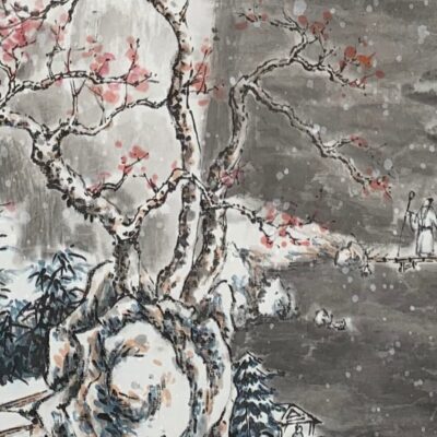
Snow Landscape, Fiona Sheng

In our many previous courses of the landscape painting exploration, we have been taking it one step at a time, and in each course we focused on one or a few of the said aspects, but now you are ready for more, so in this Snow Landscape Course:

  • We will discuss and focus on the usage of the 5 shades of ink
  • You will learn about the 2 main ways of painting snow
  • There will be a discussion about perspectives
  • You will learn to paint a vertical landscape as shown, step by step

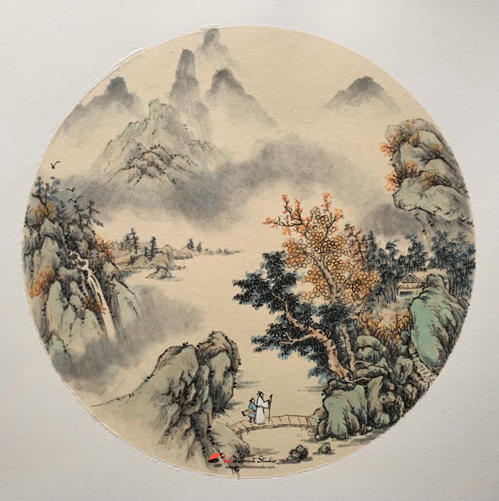
If you have taken the other landscape courses including the round and rather small scale summer landscape, the tree painting, and the landscape scenery courses, then you are definitely ready for this step, which will further advance your understanding and skills in the oriental landscape painting. If you have not taken any of the other courses yet, not to worry, enjoy this snowy scenery, and you can always retrace your steps and develop your abilities in the other aspects in depth slowly.

This week the snow landscape course will come and greet you, look forward to having you there!

Enjoy such cultural discussions? Have comments? I look forward to hearing from you!


Related Courses


Buy Artworks | Learn Brush Painting | Learn Chinese Calligraphy

Oriental landscape painting development Read More »

Oriental Landscape Painting

How much do you know about the oriental landscape painting? The oriental landscape painting is a reflection of the relationship between human and nature, it represents the connection between the natural world around us and our own inner spiritual world. The landscape painting takes limited amount of scenery to express our understanding of the universe, our affection towards the land that feeds us, and the society that supports us.

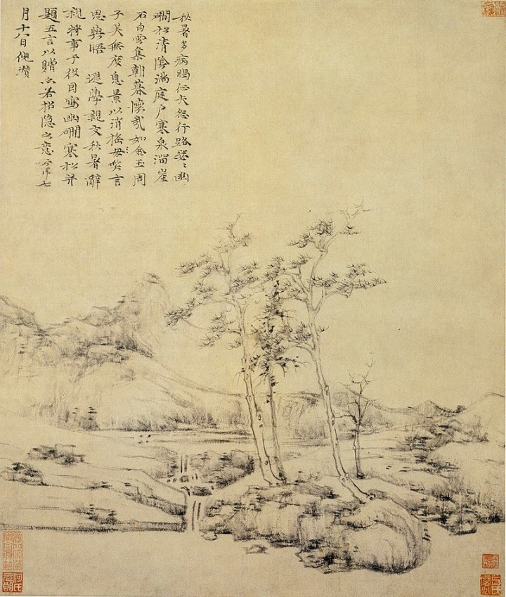
Landscape, Ni Zan

The landscape painting is imbedded in the general framework of water-ink painting, which is a painting style that utilises mainly ink and water to express our understanding of the relationship mentioned above. The simple play of ink could create endless charm through the layers of black, grey and white, via the fast and slow, moist and dry brush strokes.

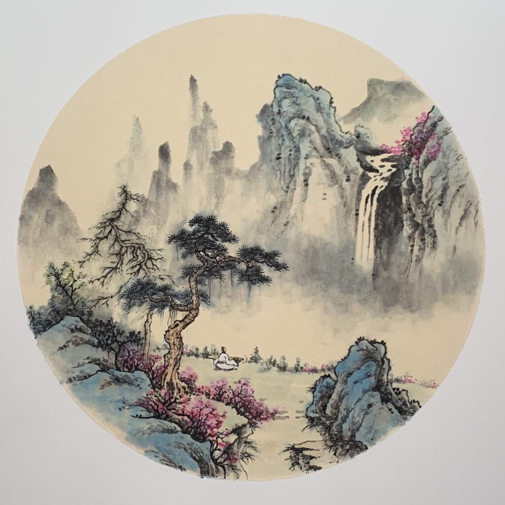
Landscape, Fiona Sheng

The landscape painting considers the painting as an integral entity, and our focus is always on the macro aspects, which is why the ways of displaying the scenery differ so much from the landscape art in the western world. In order to not be limited by our own eyes, the ancient painters developed various techniques to compensate for the limitation of our eyes, and such technique is best known as the cavalier perspective. Forget about the fancy word for a moment here, what this technique means and does is simply allowing us to have multiple eyes when looking at, say, a mountainous scenery, so that we could see the world clearly, as if we have taken the god perspective. In painting the landscapes the ancient painters then developed other supportive techniques to best use ink and brush for the best description of these landscapes. Beyond the techniques comes what is more essential, the emotions. The emotional expression in the oriental painting is ubiquitous, however the practice required to achieve this level is demanding. In the practice it is absolutely important to set the goals right, relax the mind, and enjoy the process.

Landscape, Zhao Meng Fu
Snow Landscape, Fiona Sheng

In our many previous courses of the landscape painting exploration, we have been taking it one step at a time, and in each course we focused on one or a few of the said aspects, but now you are ready for more, so in this Snow Landscape Course:

  • We will discuss and focus on the usage of the 5 shades of ink
  • You will learn about the 2 main ways of painting snow
  • There will be a discussion about perspectives
  • You will learn to paint a vertical landscape as shown, step by step

If you have taken the other landscape courses including the round and rather small scale summer landscape, the tree painting, and the landscape scenery courses, then you are definitely ready for this step, which will further advance your understanding and skills in the oriental landscape painting. If you have not taken any of the other courses yet, not to worry, enjoy this snowy scenery, and you can always retrace your steps and develop your abilities in the other aspects in depth slowly.

This week the snow landscape course will come and greet you, look forward to having you there!

Enjoy such cultural discussions? Have comments? I look forward to hearing from you!


Related Courses


Buy Artworks | Learn Brush Painting | Learn Chinese Calligraphy
Oriental Landscape Painting Read More »

Some Art Gossip

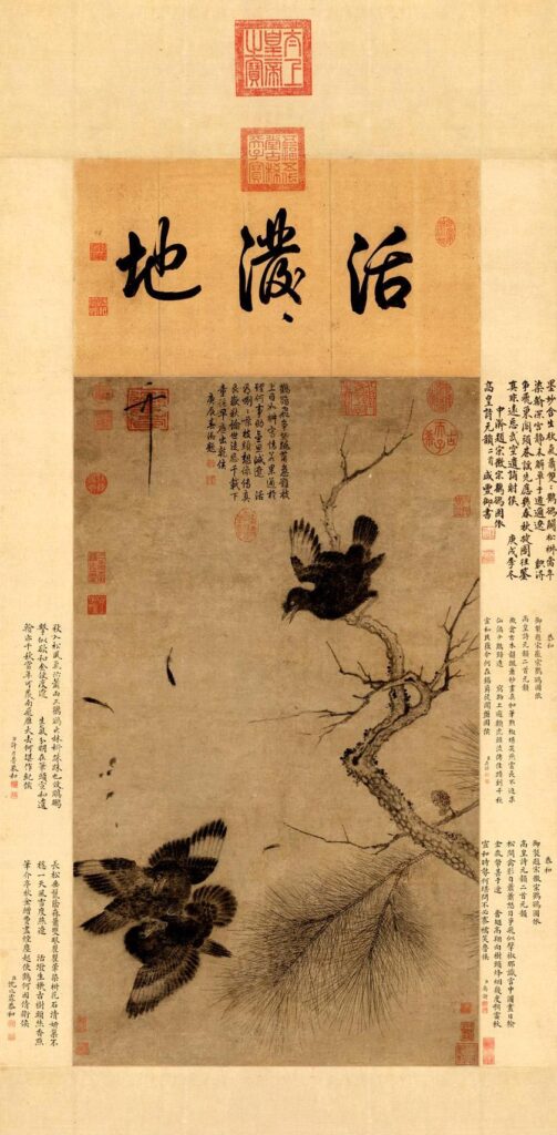
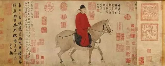
We have been going through some serious discussions with the art supplies lately, today let us do some gossiping instead! So, in the oriental art world there was an Emperor who loved collecting artworks, and then made sure everybody knew that he had ever owned such arts. This Emperor’s name is Qian Long, one of the most famous Qing Dynasty rulers (1711-1799). This Emperor enjoyed a very long and happy life, he also lead the nation through a glorious historical period. However, if I were to gossip about him, there are also plenty to say, starting from his artistic taste. Remember this piece of painting below? The largest seals all belonged to this Emperor!

Song Hui Zong

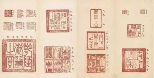
These seals blow all belonged to the Emperor Qian Long, and they are often seen in many of the most precious national art treasures. Other than his seals, this is the Emperor who also had been writing poems and other comments over the historical masterpieces. The poem in the painting above right in the middle was his masterpiece, as well as the disproportional giant characters written on top.

Seals of Emperor Qian Long, photo from the internet

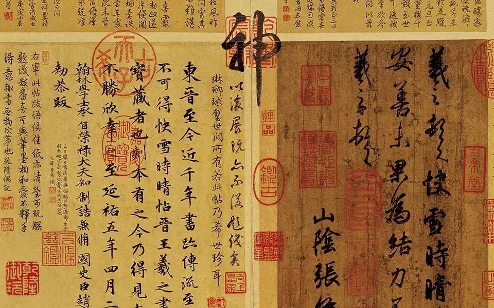
In the best museums world wide display quite a lot of precious Chinese painting and calligraphy pieces, some authentic, some copies from an early period, which is also very precious. This piece of calligraphy below was written by the most important calligraphy master, Wang Xi Zhi (330-361), his artworks served as the inspiration throughout history, influencing generations of artists to come, also dwarfing millions of giants in the Chinese calligraphy. The piece was one of Wang Xi Zhi’s later works, there are historical records marking its change of hands each time, all the way down from the Tang Dynasty, and now it is resting peacefully in the Forbidden City Museum of Taiwan. The Emperor Qian Long must have been thrilled to have added this masterpiece to his collection, which resulted in the worst “skin condition” of this artwork – see all those seals in the image below? Guess who added them? What is more, there is a gigantic character “神” (godly) written right in the middle of the artwork, also by the hands of Qian Long. He must have been very confident about his calligraphy, but very few dare making such direct comparison with the master of calligraphy. Well, confident yes, writing-wise, alas, you decide.

Wang Xi Zhi

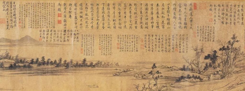
It is not only calligraphy masterpieces that suffered, there are also may paintings that suffered worse. It almost feels that the historical arts inspired the Emperor to keep a journal – the various chunks of writings below were pretty much all from the hands of Qian Long, who decided to keep the journal directly on these artworks! The second image below was the worst of them all – we can find 55 chunks of remarks all over its body – poor painting! Actually there may yet be some hope, I read recently that new evidences are questioning the authenticity of this piece, another almost identical piece that is resting quietly in the Forbidden City Museum may have been the authentic one all along! This one may have been a very close replica.

Zhao Meng Fu
Huang Gong Wang
Zhao Meng Fu

Other than having questionable taste in adding comments over artworks, this Emperor encouraged the craftsmen to make quite some “interesting” ceramic wares too. How about I keep that for another post when the gossiping inspiration hits in the coming days?

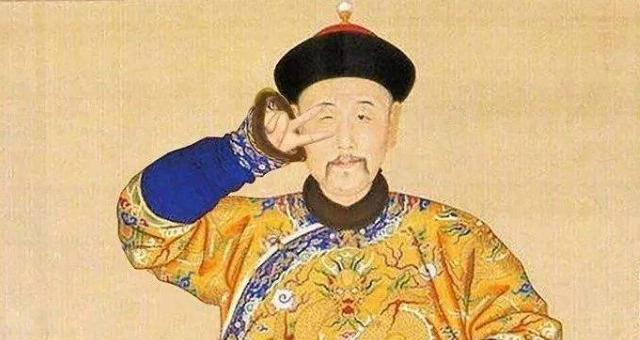
Emperor Qian Long

Enjoy such cultural discussions? Have comments? I look forward to hearing from you!


Buy Artworks | Learn Brush Painting | Learn Chinese Calligraphy

Some Art Gossip Read More »

Seal ink

In the last few posts we discussed the use of seals, hope that you are already applying these rules and suggestions in your own artworks! Today, let us take a look at the seal ink. The seal ink is literally called seal mud (Yin Ni, 印泥) in Chinese, which results in these pretty additional colors in a piece of artwork. These tiny add-ons in fact also have quite a lot of science about them.

Example of a Leisure Seal

Brief Introduction

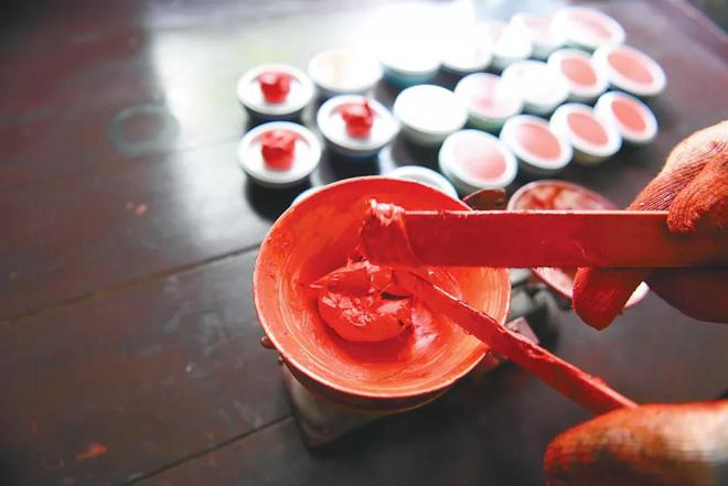
The seal ink has a rather sticky quality, and you may find some stringy fibers when using it. This is because the seal ink is made from natural ingredients such as cinnabar, herbs including mugwood, castor oil, and aromatic ingredients such as musk. The main color comes from cinnabar, but in using this material, two distinct colors could appear: the top layer is more orange whereas the bottom is more red. Therefore the most common colors of the seal ink ranges between these two shades. However, the more orange color (硃磦) is more precious than the redder variety (朱砂), and the prices of the two kinds can differ quite a bit. In the photo below there are a few seal ink colors that are common on the market. But the best color of the seal ink is quite a personal decision, it depends on the personal taste, but it should match the seal styles – strong characters perhaps work better with a solid crimson color for instance.

Seal Ink, photo from the internet

Categories

Seals are in fact used by three groups of people the most, the civil servants, the artists, and the seal craftsmen. The civil servants have rather basic requirements of the seal ink, therefore the most common kind of the seal ink on the market is meant for this use. These seal inks often appear in a plastic or metal box, round or rectangular, sometimes in the form of foam. The artists have higher standards regarding the seal ink. These seal inks have to be moist enough so that the rice paper can “grab” the best shine of the seal impression, but the oil in the seal ink cannot escape from the border to tarnish the rice paper around it either. The craftsmen have yet again different requirements of the seal ink because of the paper on which the seal is pressed is not the same. For us, it is the artistic style of seal ink that we need.

Maintenance

Seal ink of the artistic style should be stored in ceramic containers, because the characteristic of the oil in the seal ink is a tad acidy that reacts with metal. Once the seal ink is oxidised, it will become hard and dark, rendering it unusable. Ceramic containers are their best friends, but a certain amount of seal ink could only last 3-5 years, depending on the uses. The color pigments or the oil will ran out eventually, and that will be the time for some new seal ink.

Seal ink in a container

If you wonder about when it is time to change the seal ink, it is generally not hard. Once your seal ink become super oily, which happens when the color has been more or less used up, it is normally time for a change. However, first you need to see whether you have been keeping the seal ink in its best state!

Stirring of the seal ink

Tips & Suggestions

  • Be sure to mix the seal ink once in a while! Use a wooden or plastic spoon or wide stick to stir and mix the seal ink once every 6 months or so. This way the fibers, oil and color can mix more evenly, so that it displays the best result;
  • Keep the seal ink container in a place that is relatively warm and preferably constant in temperature, because extreme temperature change also alters its property;
  • Keep the seals clean, so that when using the seal ink, it is not only the fiber being brought up – dirty seals tend to do so!

Hopefully this post can be of some help when you select your seal ink! Even though the oriental art cherishes its simplicity, but you probably can see by now how much complexity is involved in it! It is precisely why we love it, isn’t it?

Enjoy such cultural discussions? Have comments? I look forward to hearing from you!


Related Products From Our Shop


Buy Artworks | Learn Brush Painting | Learn Chinese Calligraphy

Seal ink Read More »

How to use seals in artworks (3)

We have talked quite a lot about seals, what are the appropriate places for them, what their functions are, and what they represent. Today let us put together a convenient list of the “do”s and “don’t”s in seal using.

Example of a Leisure Seal

Some Rules and Suggestions

Use name seals and leisure seals

A good piece of artwork should be accompanied by nice seals. So do not forget to add them!

Use good seal ink

The material of seals can range from a few types of stones, some more precious than others, but on the artworks it is the results of these seals that we see – the impressions made with the seal ink. Seal inks can have different colors and quality, cheap seal inks are quite obvious – perhaps we can take a closer look at this in the coming days. So please pick decent seal inks to match your art!

Seal Ink, photo from the internet

Be Stingy

When deciding the number of seals on a piece of artwork, it is better to stick to the rule of “less is more”. Remember that we discussed this point in a previous post, try to stick to 1 or 3 seals max. in an artwork.

Rule of Two Seals

If you need to add 2 seals on your artwork, it is better that they are of the same sizes;

If your artwork has 2 seals, they cannot be one square and one round, nor one rectangular and one oval;

If your artwork will contain 2 seals, and you have to use one Yin style and one Yang style seal, then the rule is to use the Yin on top and the Yang below.

Yin Style Seal

Seal Size

Important reminder about the size of seals – they should match the content of the artwork. Giant seals are too overwhelming for a pleasant viewership of an artwork, and tiny ones are simply too weak.

Write Over Seals?

No. Once seals are made, no writings can appear over them.

Where Not To Seal

Do not add seals on the tree or mountain tops, over a flower or above the head of a bird.

The above are some must-knows about using seals, although the list is definitely far from exhaustive. Nevertheless, in the artistic creation such “courtesies” shall be followed, and such cultural tradition shall be cherished.

Enjoy such cultural discussions? Have comments? I look forward to hearing from you!


Related Products From Our Shop


Buy Artworks | Learn Brush Painting | Learn Chinese Calligraphy

How to use seals in artworks (3) Read More »

How to use seals in artworks (2)

Sealing requires rather strict rules, a good piece of artwork needs to be paired with courteous and proper sealing. There are many rules about the various places where the seals are allowed to appear, these seals have their corresponding names, and even their shapes. Today let us start with the categories of seals and then take a look at some of these rules!

Examples of a Leisure Seal

Shapes

There are square seals, round seals, rectangular seals, and irregularly-shaped seals.

Square Seals

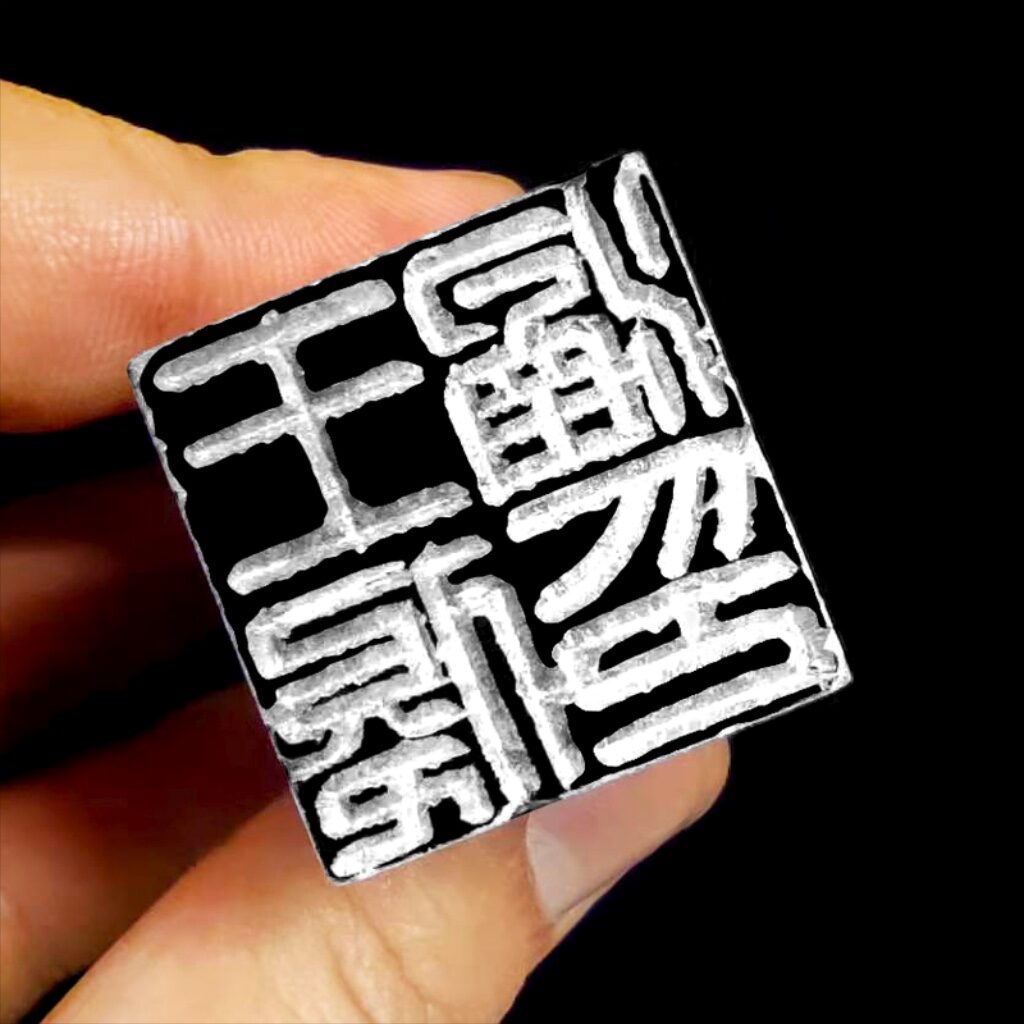
Amongst the square seals there are name seals, family seals, seals bearing the name of the studio/study, leisure seals, appreciation seals, etc. Generally speaking, the seals representing a family, a location such as a study or used for appreciation and collection are large and rather formal. The square seals are in fact the most formal, which is why almost all official seals are square. The name seal in the older days included the “extended names” as well, ranging from surname, first name, to courtesy name, pseudonym and even nickname. Some people have even more names such as posthumous title and alias. This has everything to do with the naming system of the older days, making it a lot more complicated than what we have now – let us talk about this in a separate post.

Rectangular Seals

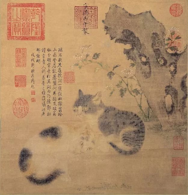
Rectangular seals often include leisure seals that appear at the “beginning” of an artwork. For calligraphy this is more obvious, because the beginning of an article is at the top right side of the paper. We give such seals the function of leading the way for our viewers, introducing this artwork to them, and such seals rarely contain images. On the right side of these seals there will be no more writings. Sometimes the rectangular seals can also be appreciation seals, used by critics and collectors. The three rectangular seals in the painting below are all appreciation seals.

Cat Painting, Emperor Ming Xuan Zong (1399-1436)

Round Seals

Chinese use round seals for appreciation seals a lot, whereas the Japanese use them for name seals mostly. The top right corner of the painting above has a round appreciation seal in fact. The round seals can also have images, and are used as regular leisure seals.

Irregular Seals

Oval is the most often seen irregular shape of a seal. These seals can serve the function of leading the viewer at the start of an artwork, as the rectangular seals do. The other irregular shaped seals are mostly leisure seals that can appear in the middle of an artwork.

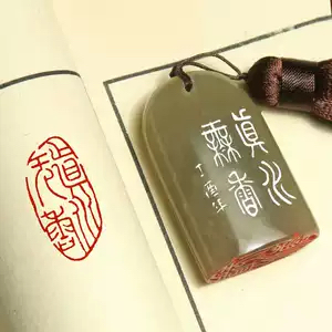
Various Seal Shapes, photo from the internet

Position

Leading Seals

We have already mentioned that both rectangular seals and the oval seals could lead the way in a piece of artwork, which can be seen in the painting below, on the very top section. This section was added to the original artwork during the mounting, so that the writings of a later Emperor could appear in this artwork. The top right seal serves to lead the way.

Flower Bird Painting, Emperor Song Hui Zong (1082-1135)

Middle Seals

At the “waist” of the an artwork, so somewhere in the middle of a long vertical piece, there can also be seals, so that the weight of the artwork is more evenly distributed. Such seals can be any leisure seal.

Corner Seals

The corner seals most often appear at the bottom corner of an artwork, either left or right. These seals are usually square – rectangular, oval or any irregular shapes are not supposed to appear here. These seals are used to hold together the artwork, and therefore they have to be strong, square, and usually compatible in size to the name seal above.

Therefore, in the previous post the question about which seals may have been the original seals from the artwork above, the answer should be much clearer! The top left side overlapping with the name of the artist is the name seal (an emperor remember, the name seal is rather large), and most likely the only other original seal is on the bottom right corner, the square one which is the corner seal. The small writings in the middle on top did not belong in this piece of painting, because it disturbed the flow of the composition, and therefore any seals involved there must have been new. The other round seals and the very large square seals are all appreciation seals. Did you get it right?

In the coming post we will talk about the “do”s and “do not”s in sealing, so stay tuned!

Enjoy such cultural discussions? Have comments? I look forward to hearing from you!


Related Products From Our Shop


Buy Artworks | Learn Brush Painting | Learn Chinese Calligraphy

How to use seals in artworks (2) Read More »

How to use seals in artworks (1)

Continuing from the previous topic on the seals, let us look at how the seals are used. The correct usage of seals affect the overall quality of the artworks, and even though we see many possible examples of all kinds of ways of sealing, it is absolutely crucial to understand the foundations of the art of sealing, and upon which we can fully engage our creativity.

Examples of a Leisure Seal

Size

The size of a seal should match the characters in an artwork. Generally speaking larger artworks may have larger writings on them, and therefore will be complimented by relatively larger seals. If there are small characters written (such as a poem), it is then common to include (a group of) small seals instead. The seals need to balance the painting, so larger seals often appear on the bottom of an artwork, if the artwork has more than one seal. In the case that an artwork was created by a few artists, then the various seals should match in size.

Number

In the ancient time people preferred odd number of seals in an artwork. One or three is the most common. Now this preference is less followed, but the guideline is “less is more”, so when in doubt, go for fewer seals. Also do not use the same seal twice in the same artwork.

Flower Bird Painting, Emperor Song Hui Zong (1082-1135)

Placement

The location of a seal affects the balance of the artwork, therefore the seals are often used as part of the composition. The loose space shall be left loose, while the tight space perhaps should be made even tighter with an additional seal. Normally there are name seals and the leisure seals, but within the leisure seals there are several functions that the seals fulfil. We will discuss this in detail in the coming post.

Weight

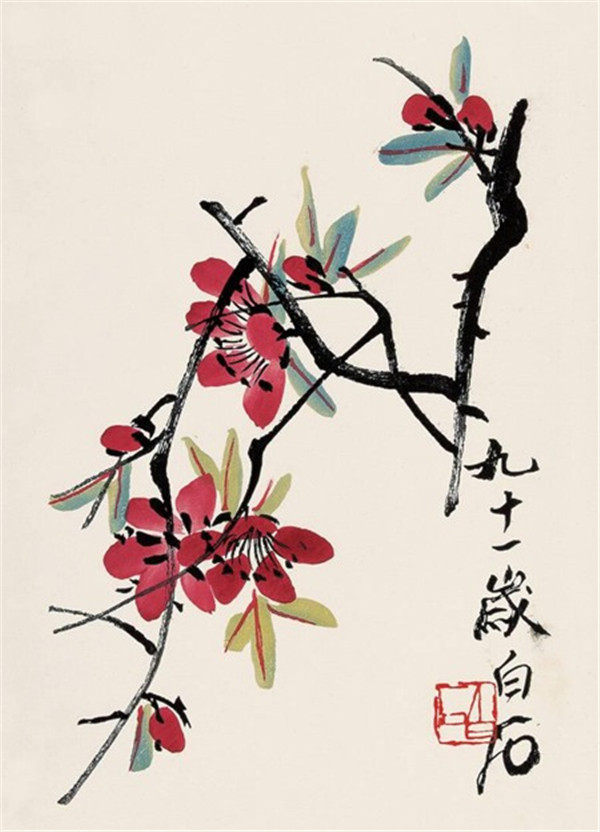
The seals carry “weight” in its color and strength that appears on the surface of an artwork. The Yin style (white lines) usually weigh heavier than the Yang style (red lines). Depending on the emotion of the artwork, we need to choose the corresponding seals for it. For example, the rough artworks may work better with the Yin style seals, whereas the delicate paintings most likely match the Yang seals better. Treat the color of the seal as another color added into the artwork, where between the red and the ink there shall be harmony.

Flower Bird painting, Qi Bai Shi (1864-1957)

Meaning & Script

The meaning of the leisure seals shall match the overall meaning of the artwork, which is the reason why we need several leisure seals. The overall harmony and balance is the key message, and whatever we add in terms of seals should contribute to it instead of harming it. The script of the characters on the leisure seals are often different, some are cursive, some are fine, and others are rough. These different scripts should suit the atmosphere generated by the artwork too, a very rough seal may not work best with refined painting style.

Flower Bird Painting, Emperor Song Hui Zong (1082-1135)

Knowing everything that we have discussed above, let us put the ideas in practice. The image above captured one of the national treasures, an amazing painting from an outstanding artist – Emperor Song Hui Zong. Horrible as he was as an emperor, his taste in art was impeccable. The huge amount of seals all around came from collectors over the past thousand years, so were most of the writings. Could you tell which seals and perhaps writings were original and why? We will discuss this further in the next post as we continuously dive into the usage of seals!

Enjoy such cultural discussions? Have comments? I look forward to hearing from you!


Related Products From Our Shop


Buy Artworks | Learn Brush Painting | Learn Chinese Calligraphy
How to use seals in artworks (1) Read More »

error: Content is protected !!
Scroll to Top